How to Draw the Ferrari Logo
In this drawing lesson, we’ll show you how to draw the Ferrari logo with its iconic shield and the horse silhouette.
Drawing car logos often involves schematic and symmetrical techniques to ensure the final image looks accurate and recognizable.
The Ferrari logo is a good example of this approach. The shield itself is a clearly structured, symmetrical shape, while the horse inside it is intentionally asymmetrical and highly stylized.
Capturing this contrast is one of the main goals of this Ferrari logo drawing lesson.
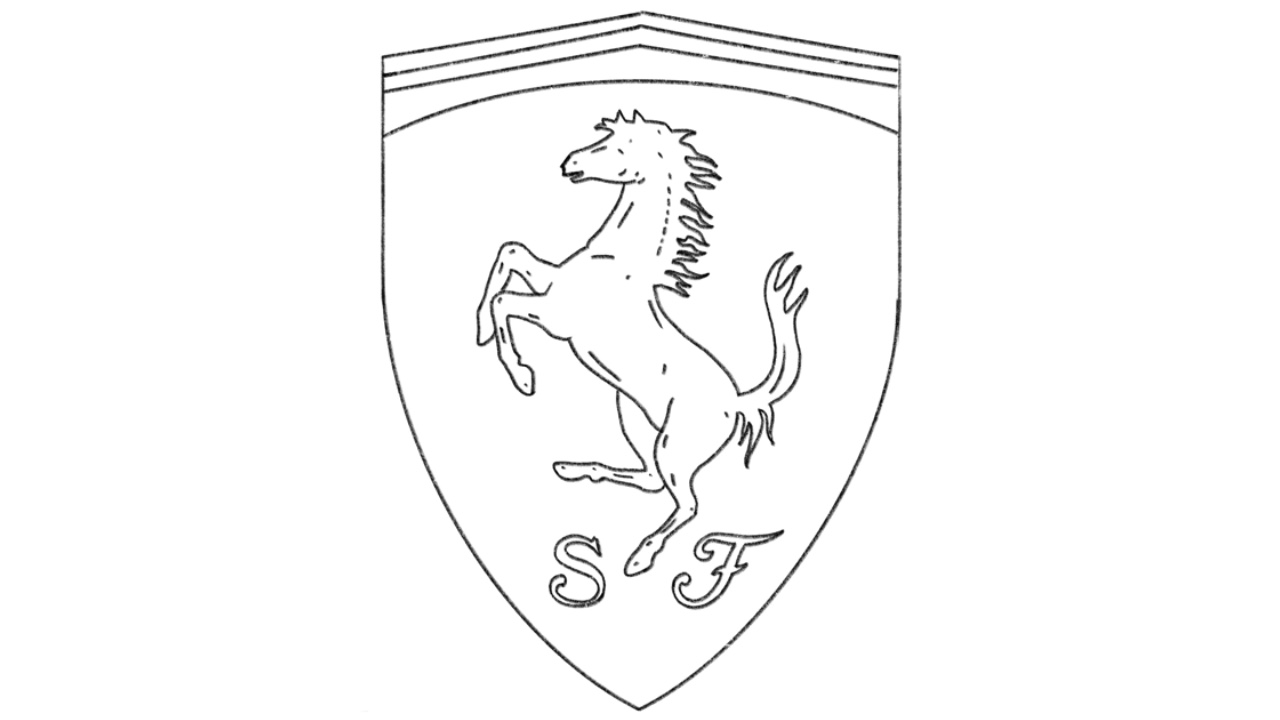
How to draw the Ferrari logo: step-by-step tutorial
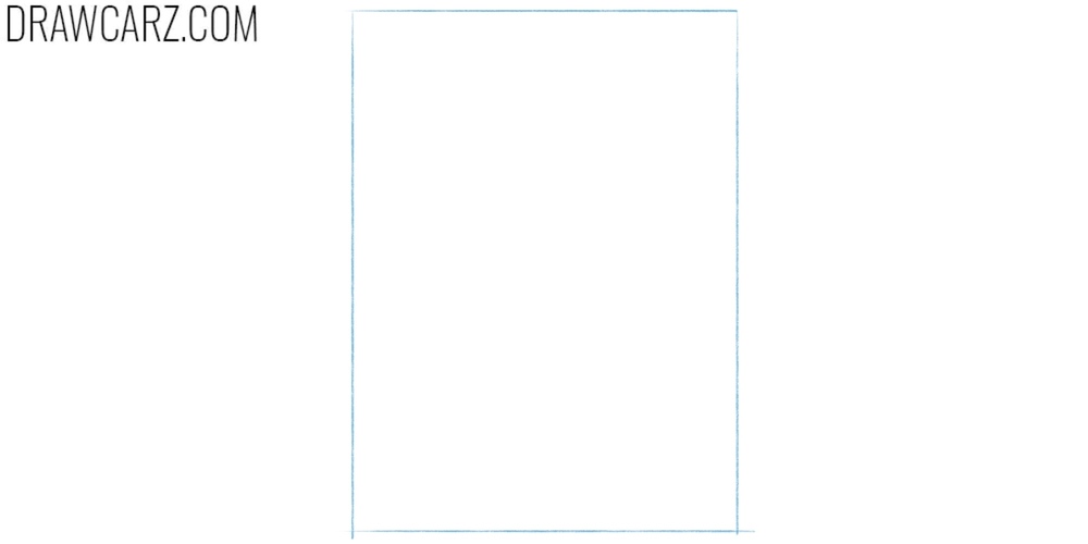
Step 1 – Define the logo boundaries
Set a simple working area for the shield. Sketch a tall rectangle that will contain the entire Ferrari logo. This frame is not part of the final outline, but it keeps the proportions stable from the first lines to the last. Keep the vertical sides straight and the corners sharp. Make the rectangle a bit taller than it is wide, since the Ferrari shield is vertically oriented.
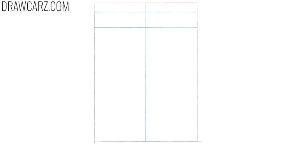
Step 2 – Add the symmetry guidelines
Add construction lines to control symmetry and spacing. Draw a vertical centerline through the rectangle, then mark a narrow horizontal band near the top of the Ferrari logo. This top band helps you place the upper border of the shield and leaves room for the small details above the horse. The centerline is especially important because the shield is symmetrical even though the horse inside it is not. Check that the left and right halves of the rectangle match before moving on.
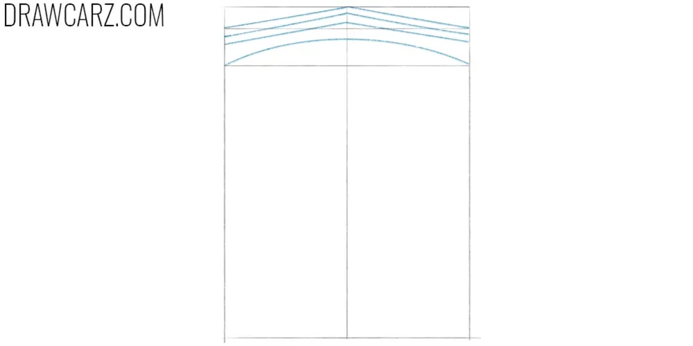
Step 3 – Draw the top edge of the Ferrari logo
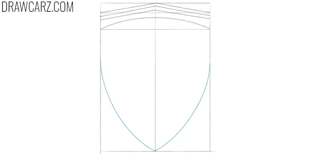
Build the top contour of the shield using smooth arcs. Sketch a curved top edge, then add a second line below it to form the thickness of the upper rim. Next, add the rest of the lines below to complete the top edge. Keep these lines symmetrical and proportional.
Step 4 – Draw the bottom edge of the Ferrari logo
Define the full shield shape by adding the side curves and the pointed bottom. From the ends of the top rim, draw two symmetrical curves that taper downward toward the center. Let the sides narrow gradually, then meet at a clean point at the bottom. Keep the point aligned with the vertical guideline.
Step 5 – Sketch the horse head and mane
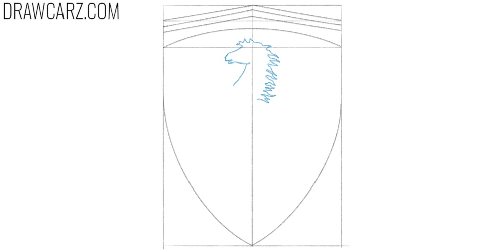
Begin the horse silhouette by placing the head and upper body inside the shield. Use the top band as a reference so the horse sits slightly below it, leaving space above. Sketch the head facing left, then indicate the neck and the beginning of the mane with simple lines.
Step 6 – Add the front legs and chest
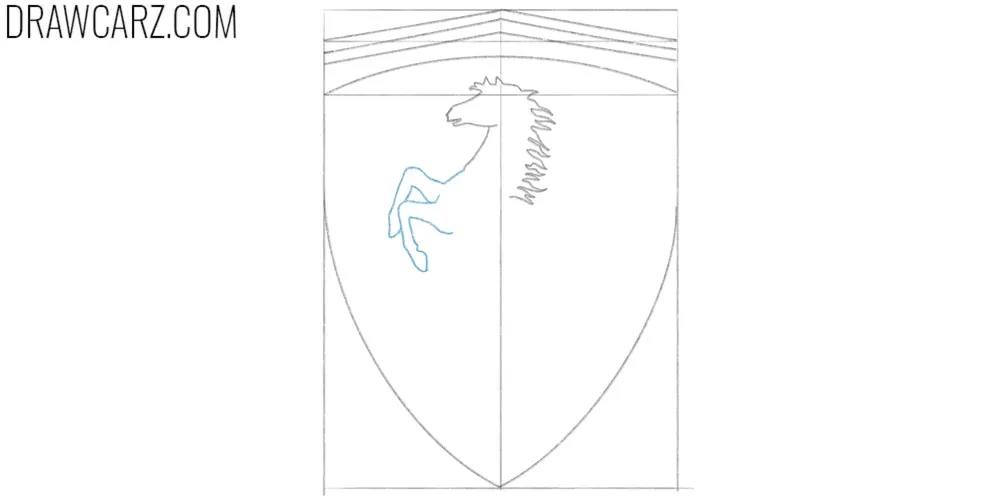
Add the front half of the horse to establish the rearing pose. Draw the raised front legs and the chest using smooth lines. The legs should appear bent and lifted, separated from one another. Use the vertical guideline to keep the figure visually centered, even though the pose itself is asymmetrical.
Step 7 – Draw the tail of horse on the logo
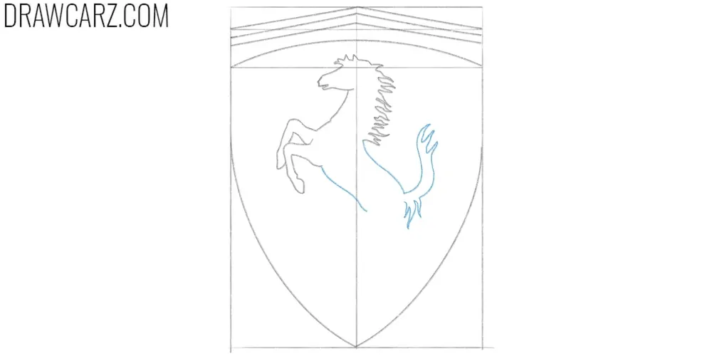
Develop the rear part of the horse and complete the main gesture. Sketch the back line and tail with simple curves. The horse’s torso should noticeably narrow toward the belly area. The tail in the logo has a distinctive, recognizable shape, so try to replicate it as accurately as possible.
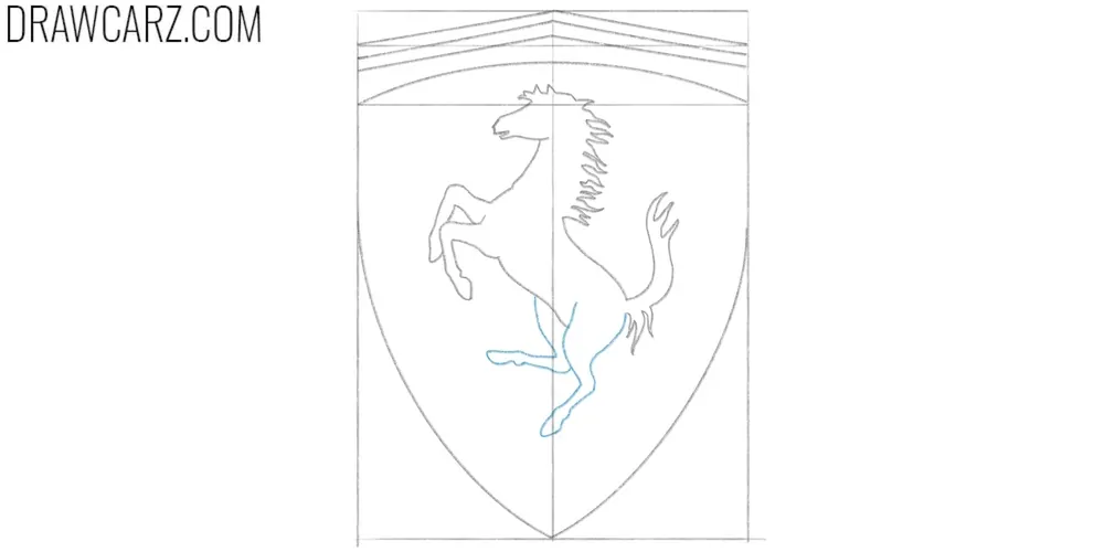
Step 8 – Finish the horse limbs
Continue the lines from the previous step and carefully draw the horse’s legs. They should be noticeably wider at the upper part and gradually narrow toward the hooves. Clarify the contours of the legs, tighten the hooves, and adjust the mane and tail so they look accurate to the original logo.
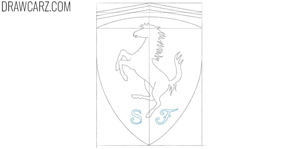
Step 9 – Draw the letters in the Ferrari logo
Add the small lettering at the bottom of the shield. Draw the “S” and “F,” keeping them centered and positioned above the pointed tip. Use simple letterforms without extra decoration. Check spacing and alignment carefully.
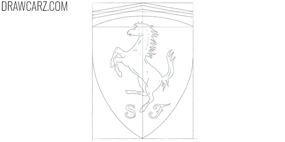
Step 10 – Add highlights to the silhouette
The horse inside the Ferrari logo is drawn as a silhouette, but it still features highlights in different areas. Try to convey these highlights using short, slightly curved lines in the spots shown in our example. Also check the symmetry and overall correctness of the horse and make sure it is properly positioned within the logo.
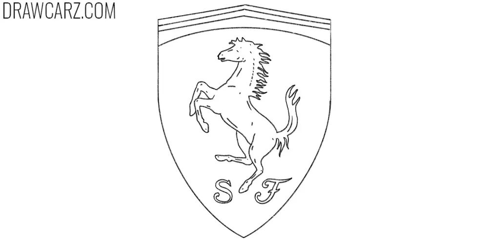
Step 11 – Finalize the Ferrari logo drawing
Clean up the Ferrari logo drawing by erasing construction lines and strengthening the final contours. Remove the rectangular frame, the centerline, and any remaining guide marks. Slightly darken the outer shield outline and the horse silhouette to separate them from the background.
Customization and finishing ideas
In our Ferrari logo drawing lesson, we showed how to draw a linear version that works well as a base for further refinement and additions.
For example, you can color the finished logo using the brand’s recognizable colors. Over different periods of Ferrari car production, these colors varied slightly but always remained recognizable.
Coloring the Ferrari logo in shades of gray or black using hatching is also a solid option when drawing this logo.
In addition, we should note that the Ferrari logo has existed in several different variations with different shield shapes.
You can try repeating the entire drawing while giving it a slightly different look by changing the shield and other small details for greater customization.
Further steps in drawing Ferrari cars
Of course, drawing Ferrari logos is not the only way to use the skills gained in this drawing lesson. One of the most important ways to apply these skills is drawing the Ferrari car itself.
On Drawcarz, there are many different Ferrari drawing lessons featuring various models, all explained in a very detailed and in-depth manner.
This allows you to draw a Ferrari of almost any type and complement it with a detailed logo placed on the hood or in the center of the wheels.
To practice coloring this legendary logo, as well as cars from different years and models, be sure to visit our collection of Ferrari coloring pages.
And to stay updated on new sports car and vehicle drawing lessons, as well as our signature coloring pages, follow us on social media and subscribe to our email newsletter.


